
Goal
The primary goal is to enhance the user experience and drive engagement on Zara's website by addressing existing pain points and introducing user-friendly features.
Pain Points:
Navigation Difficulty: Users struggle to locate account settings, bookings, and past orders due to their absence from the main website navigation.
Cart Visibility: Cart details are not immediately visible, requiring users to scroll down for essential actions like editing quantities and checking totals.


Improvements:
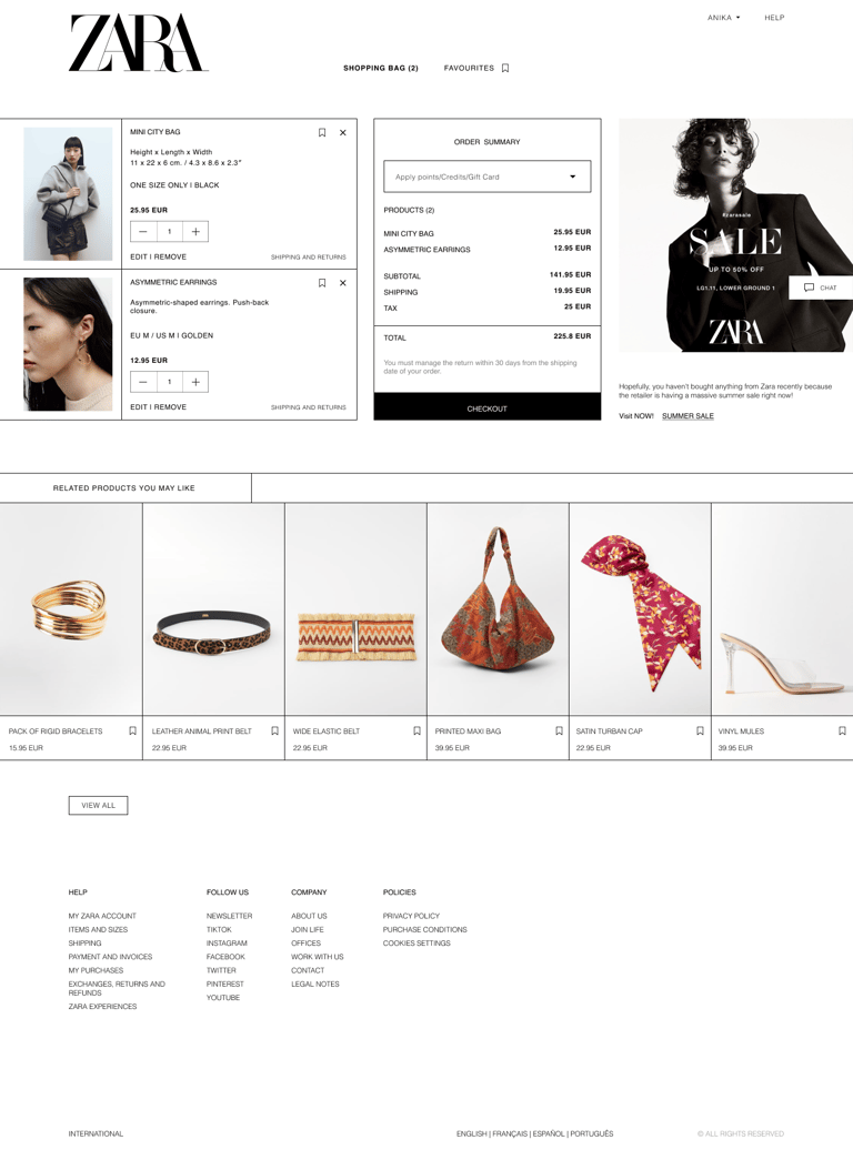
Enhanced Navigation: A new account dropdown in the Navbar provides easy access to account settings, bookings, and past orders, improving user accessibility and reducing frustration.
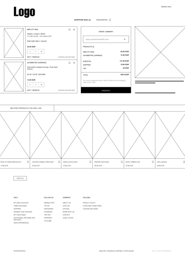
Redesigned Cart Layout: Implemented a Zara-style table view for cart details, featuring product thumbnails, names, prices, quantities, and totals side by side. Additionally, a prominent shopping cart box, highlighted subtotal and total amounts, and a clear 'Checkout' button streamline the checkout process, making it more intuitive and efficient.
Promotion Integration: Integrated a section during checkout where users can easily spot ongoing sales or offers, increasing the likelihood of additional purchases and enhancing the shopping experience.
Related Products and Favorites: Users can explore related products and conveniently save items for future consideration with the addition of a 'Favorite' button on the redesigned cart page.
Consistent Design: The footer remains unchanged to maintain consistency with Zara's established design, ensuring a seamless integration of new features with the existing user flow.


